

DID YOU KNOW?
A design system is a comprehensive collection of guidelines, principles, and reusable components that ensure consistency, coherence, and efficiency in design and development processes. It serves as a centralized resource for designers, developers, and other stakeholders, providing a common language and framework for creating cohesive user experiences across products, platforms, and channels. By promoting standardization and scalability, design systems streamline workflows, foster collaboration, and enhance the usability and brand identity of digital products and services.
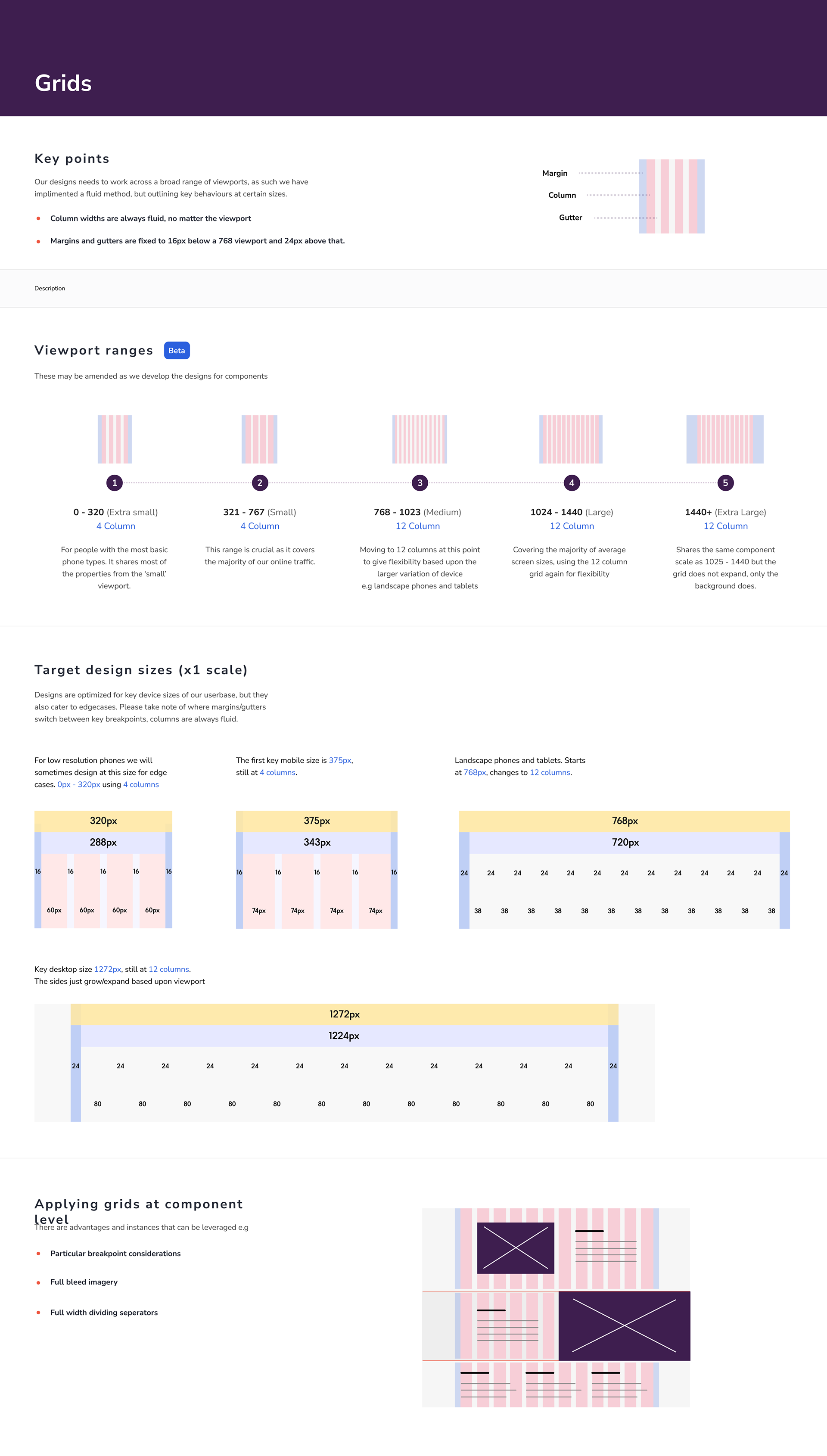
Grids and padding are foundational elements in UI design, crucial for creating visually appealing, organized, and user-friendly interfaces. Grid systems provide structure and alignment, helping to establish hierarchy, balance, and consistency in layout composition. By dividing the screen into columns and rows, grids facilitate the placement of elements and ensure that content is logically arranged and easy to navigate. Additionally, proper padding around elements creates breathing room, enhances readability, and prevents clutter, contributing to a more comfortable and aesthetically pleasing user experience.
Together, grids and padding form the backbone of effective UI design, promoting clarity, order, and usability across digital interfaces.
Together, grids and padding form the backbone of effective UI design, promoting clarity, order, and usability across digital interfaces.

IMPORTANCE
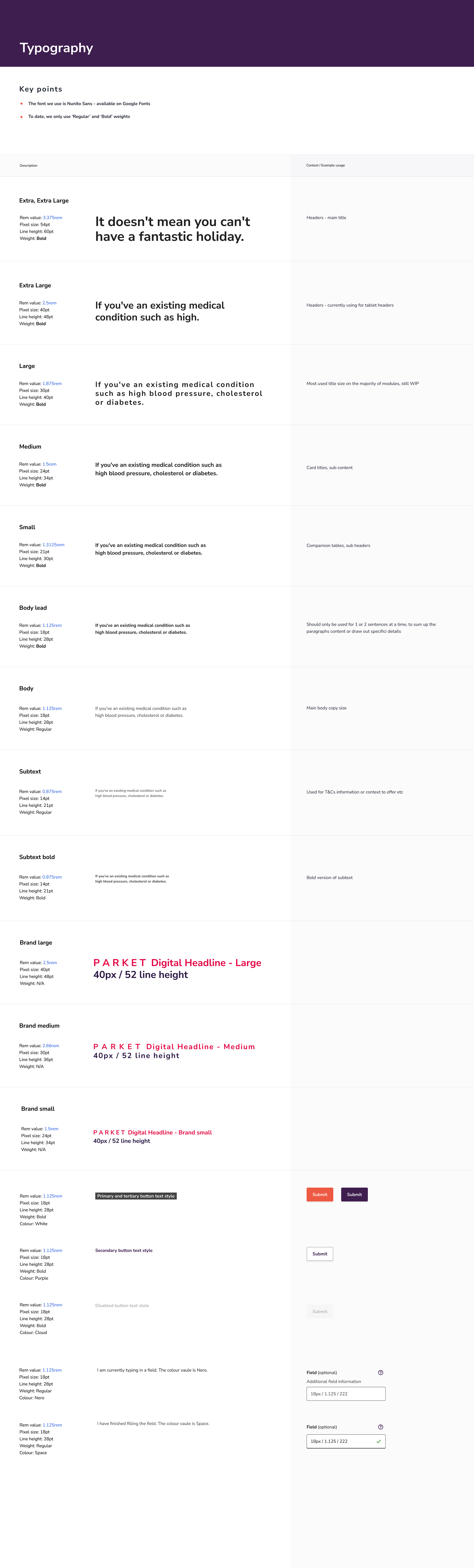
OF TYPE
OF TYPE
Typography plays a crucial role in UI design by ensuring readability, establishing visual hierarchy, and expressing brand personality. Well-chosen typefaces, font sizes, and styles contribute to the clarity and organization of content, guiding users through the interface and emphasizing key information. Consistent typography across touchpoints strengthens brand identity, fosters user engagement, and creates a cohesive and memorable user experience.
Crafted with precision and purpose, our buttons are designed to be intuitive and inviting, encouraging users to take the next step with confidence. Clear labels and prominent styling ensure that they stand out amidst the interface, making it easy for users to identify and engage with them. Consistency is key, and our comprehensive button system ensures uniformity across all touchpoints, reinforcing brand identity and streamlining the user experience. Whether on web or mobile, users can expect a seamless interaction that aligns seamlessly with the Parket brand.


