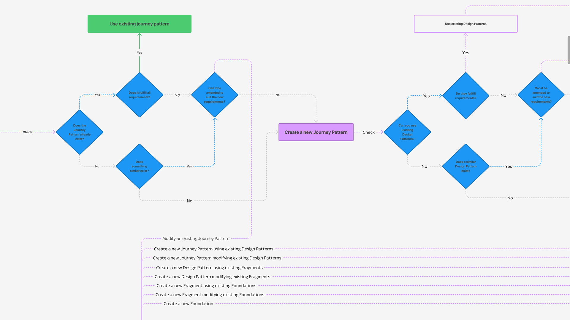
A strategic library off the back of an extensive website audit for BRE in the UK.
DID YOU KNOW?
Color is essential in UI design for its ability to convey information, evoke emotions, and establish brand identity. It aids in creating visual hierarchy, guiding user attention, and ensuring accessibility for all users. Consistent use of brand colors reinforces brand recognition, fosters inclusivity, and enhances the overall user experience.
IN CONCLUSION
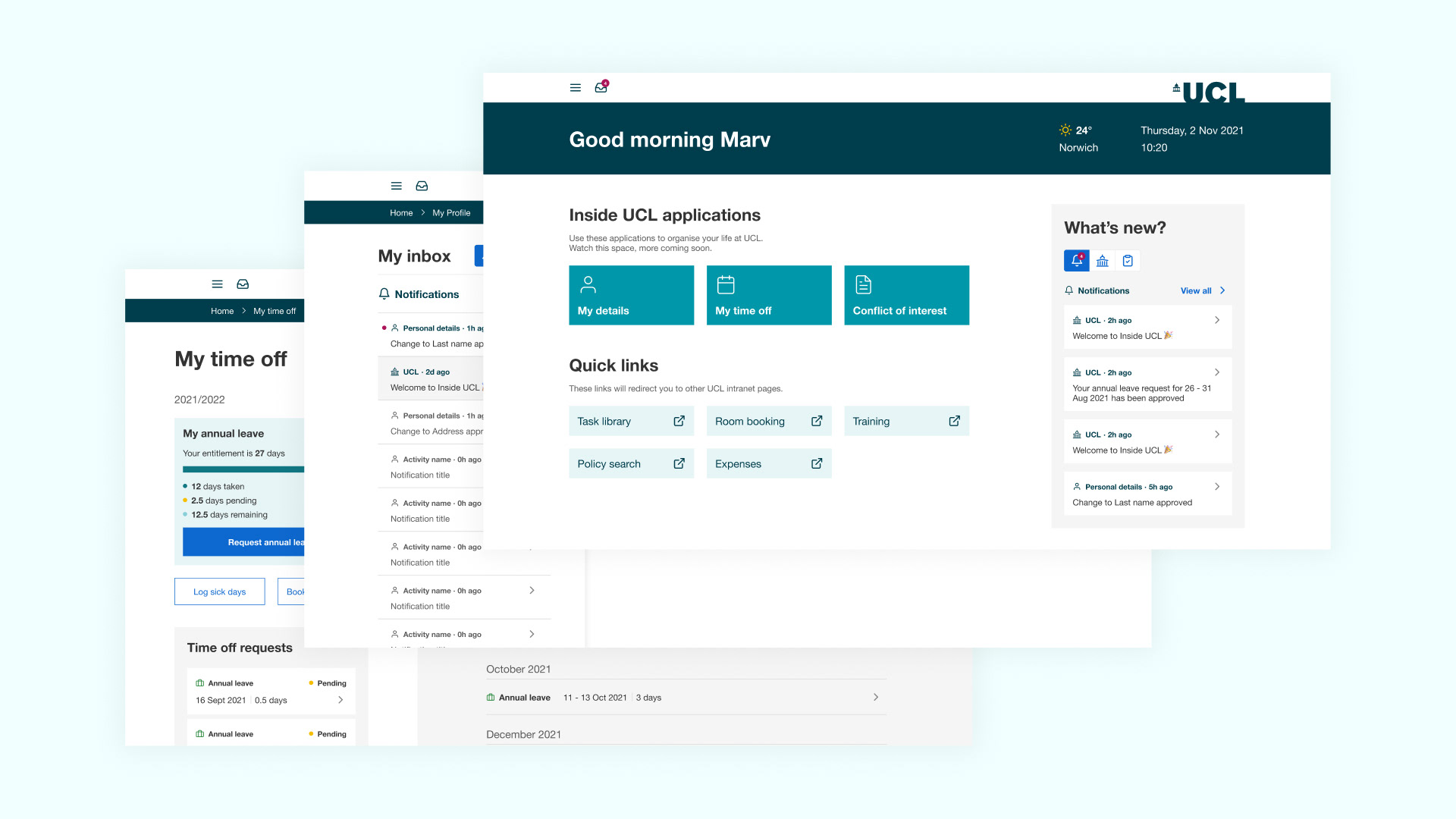
The strategic component library for the BRE website overhaul serves as the cornerstone for consistency, efficiency, and scalability in design implementation. By meticulously curating a comprehensive collection of reusable components, ranging from navigation menus and buttons to form elements and data visualization widgets, the library streamlines the design and development process while ensuring visual coherence and brand alignment across the entire website. With an emphasis on modularity and flexibility, this component library empowers designers and developers to quickly assemble cohesive and user-friendly interfaces, facilitating a seamless and impactful user experience for visitors to the BRE website.

