Outcomes
• Created a memorable FMCG brand from concept to shelf
• Enabled early-stage sales growth through visual storytelling and campaign rollout
• Built recognisable visual equity for a breakout SKU under the Tipo Tinto umbrella
• Laid the foundation for seasonal, regional and retail expansion across southern Africa
• Built with heart at Lowkey.club — where brand stories move fast and land loud.
Rum
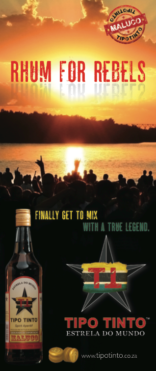
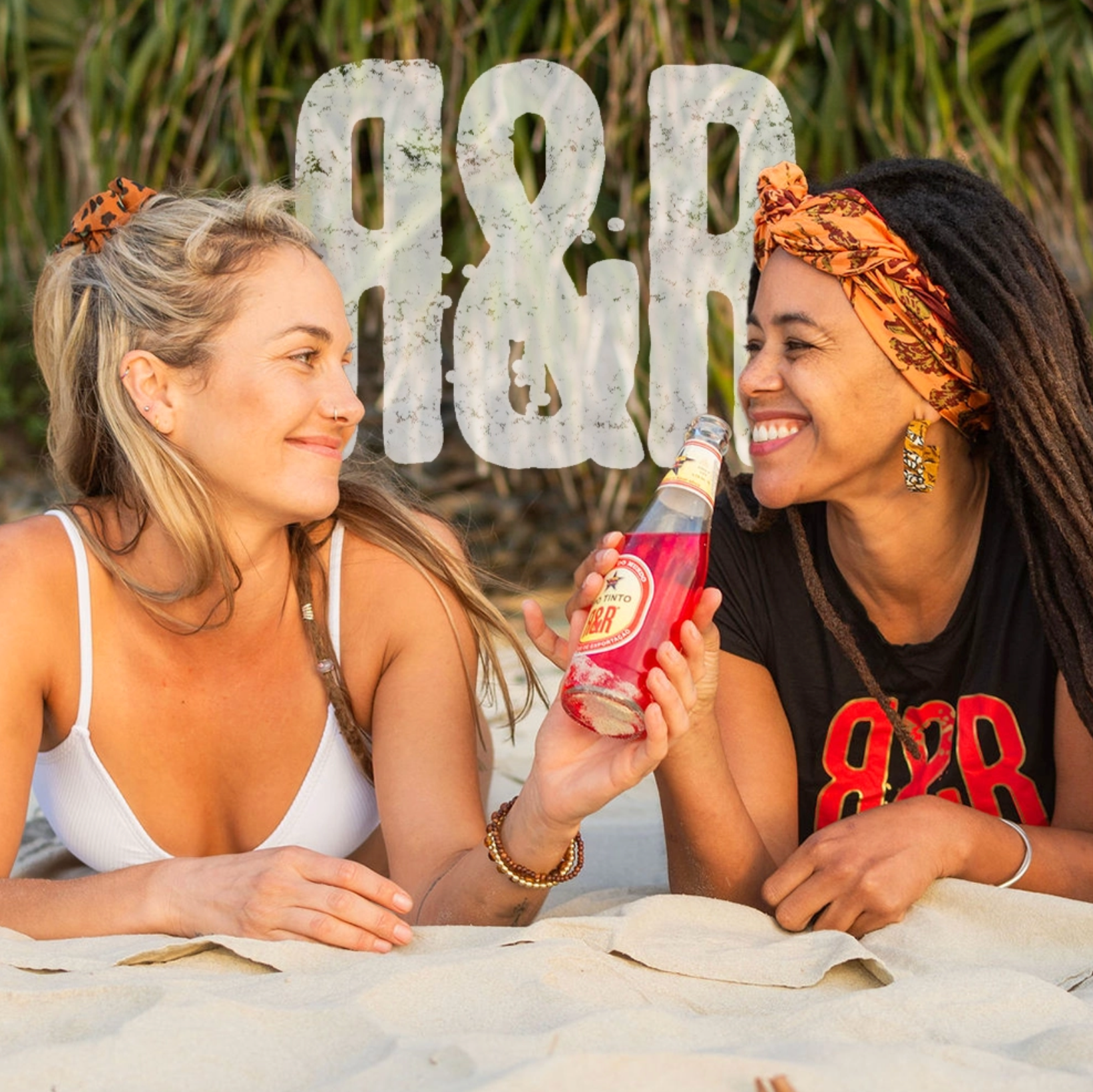
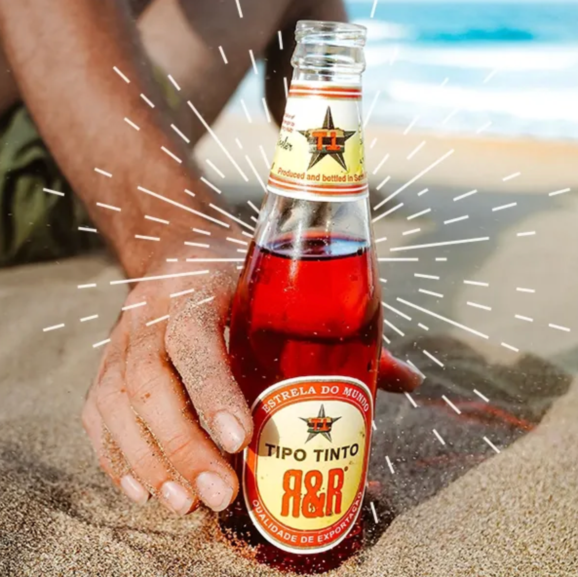
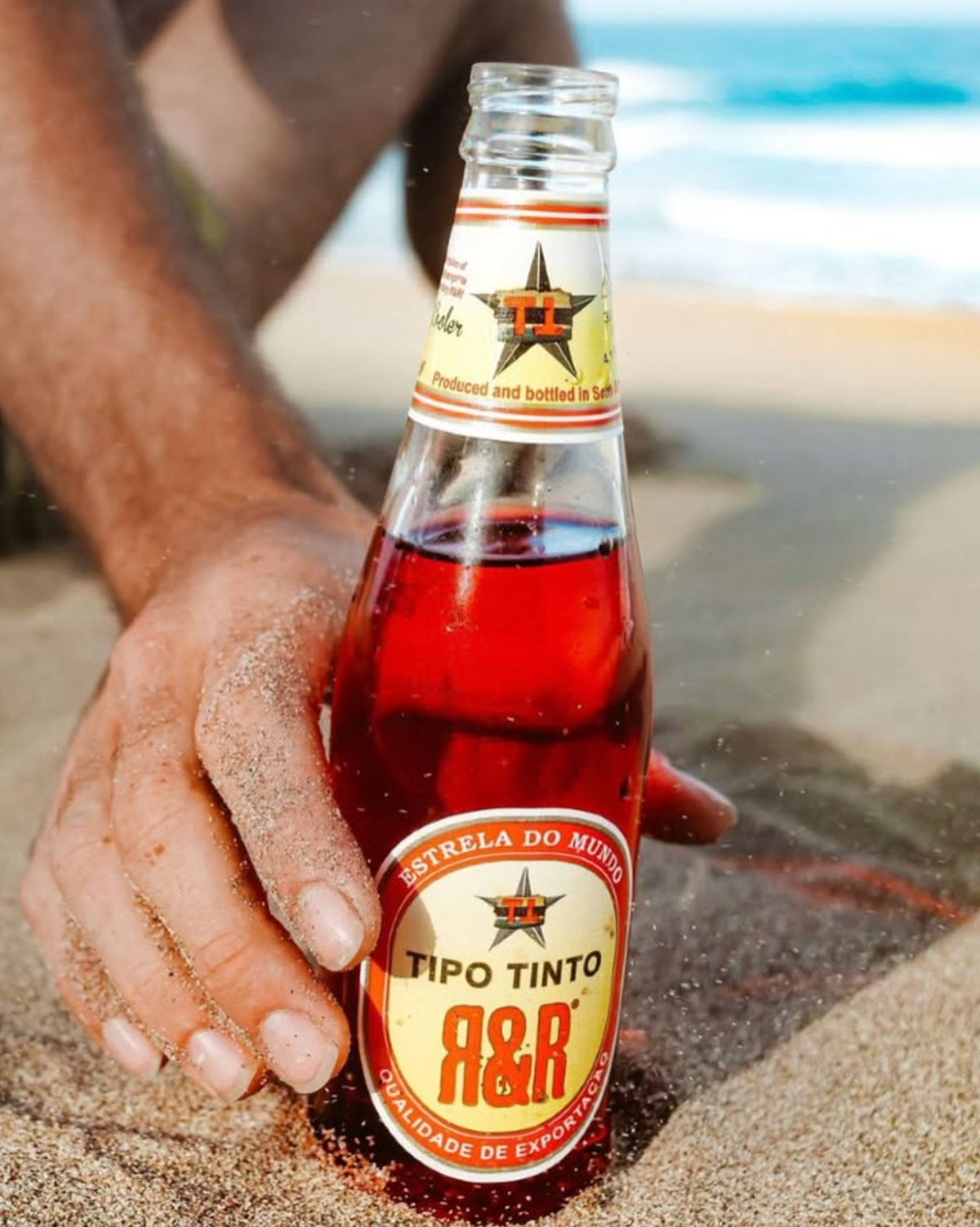
Rum & Raspberry — Tipo Tinto Roots
Brand Identity | Packaging | Campaign Creative | Photography
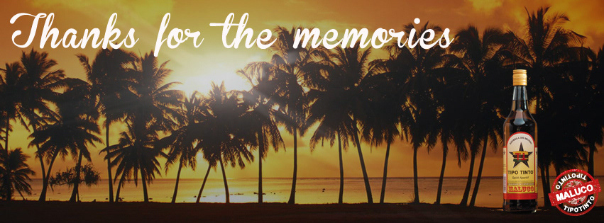
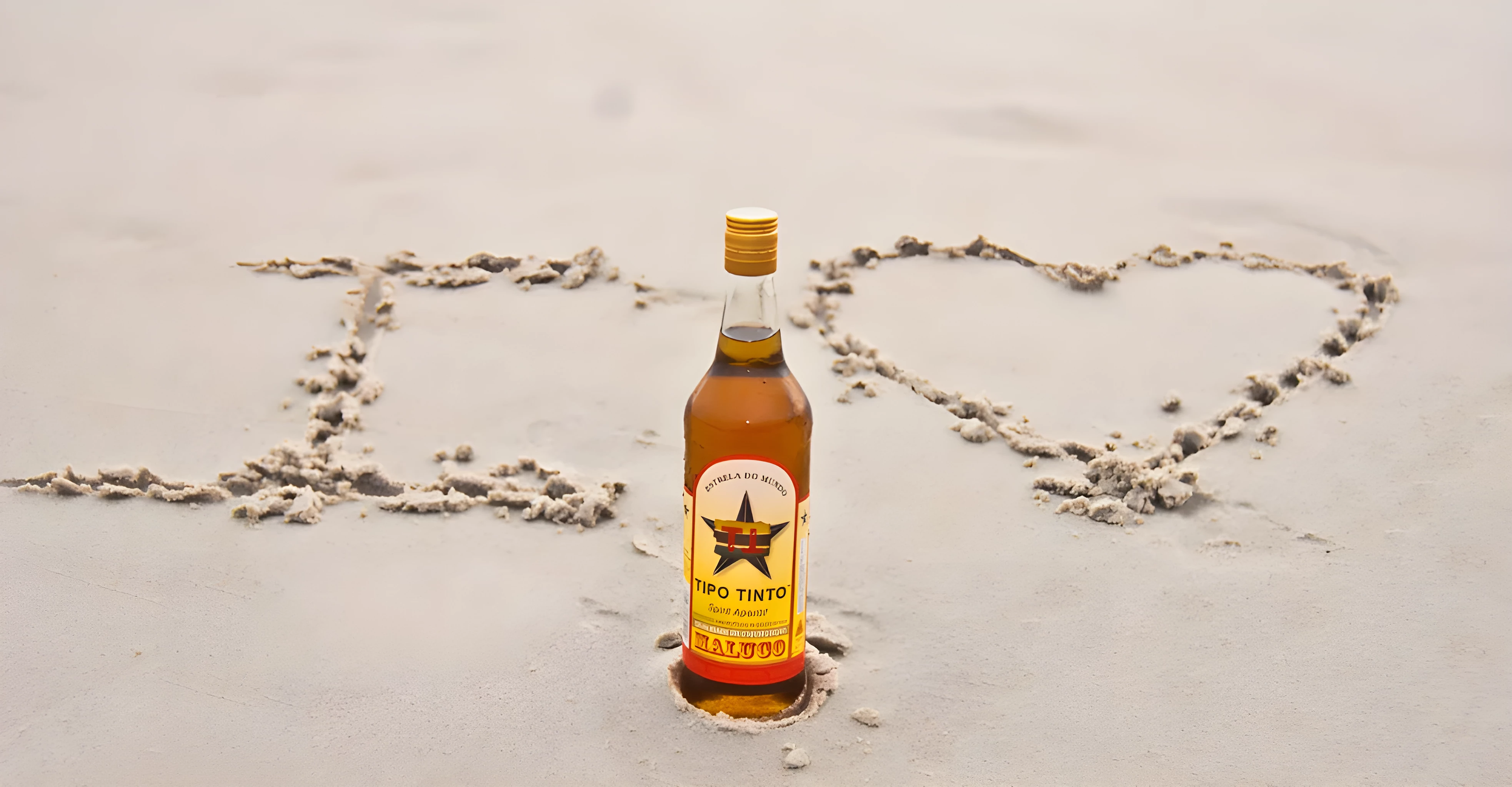
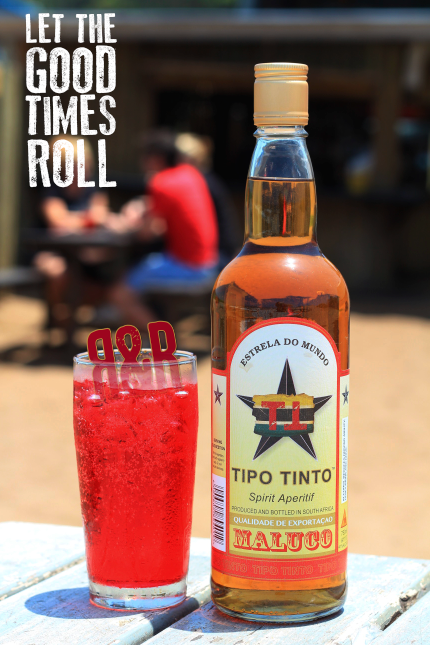
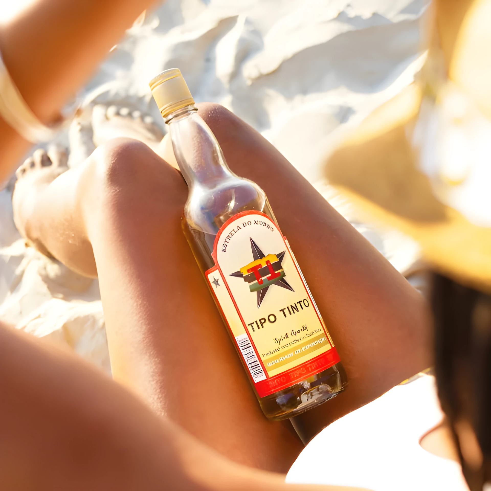
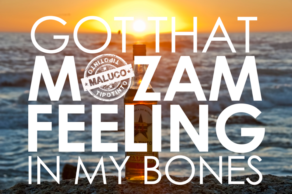
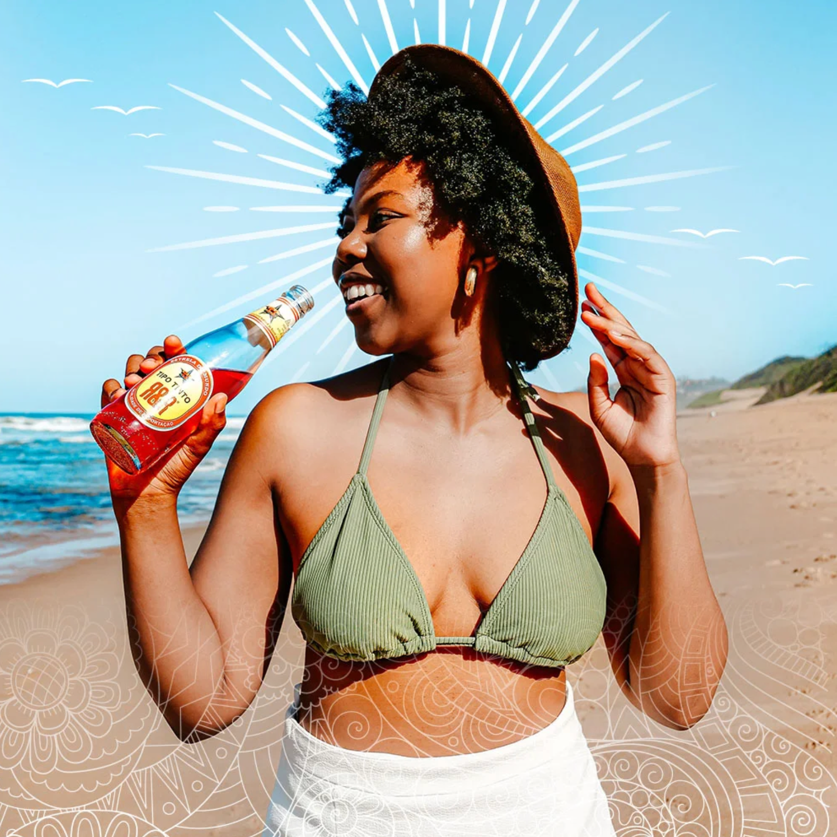
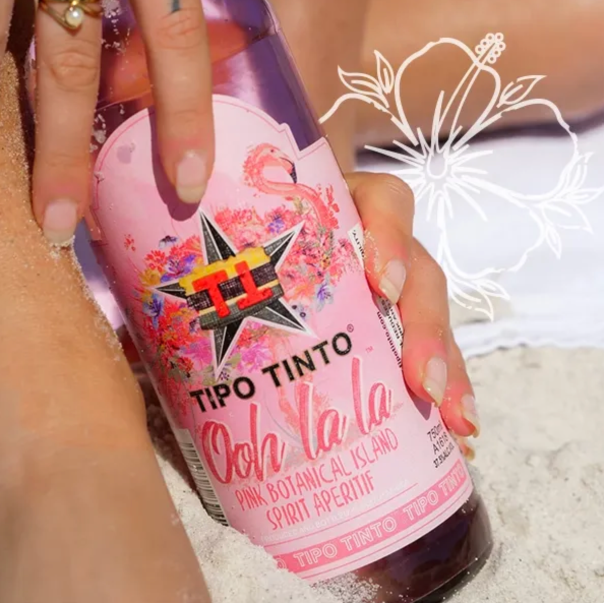
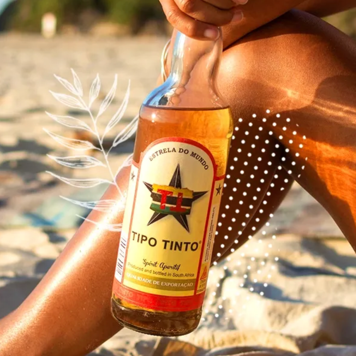
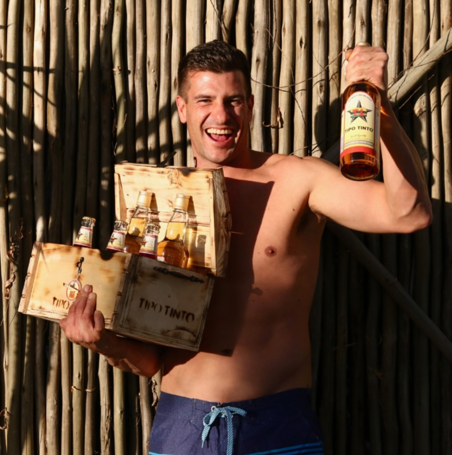
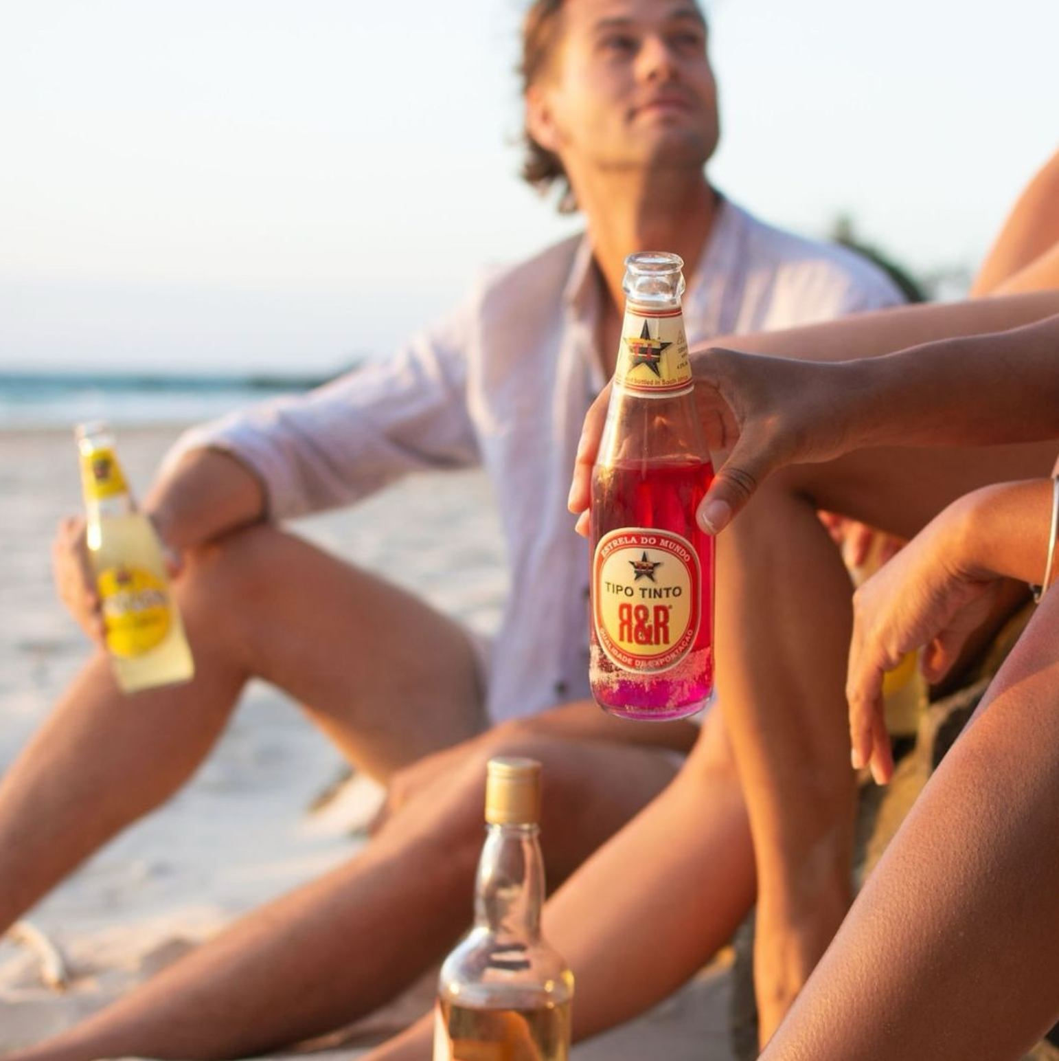
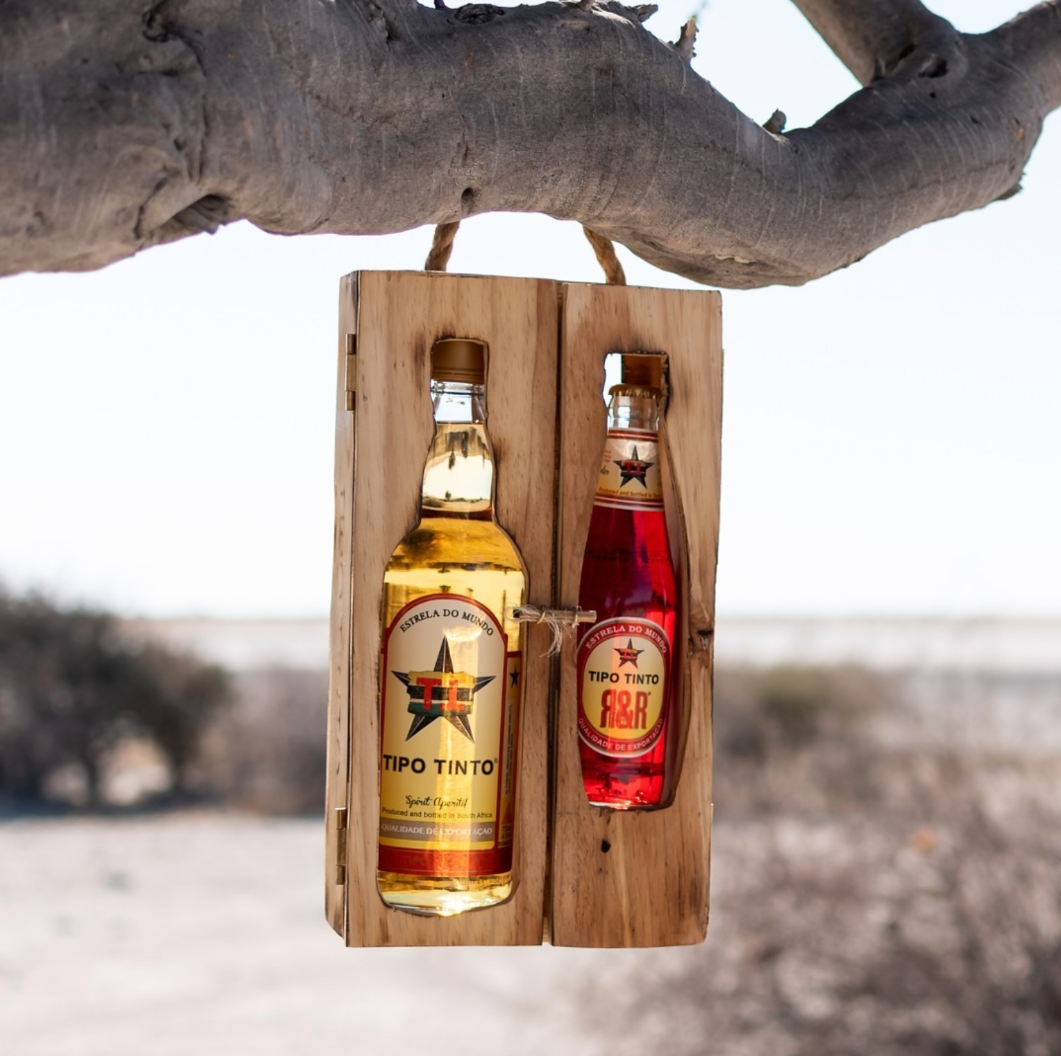
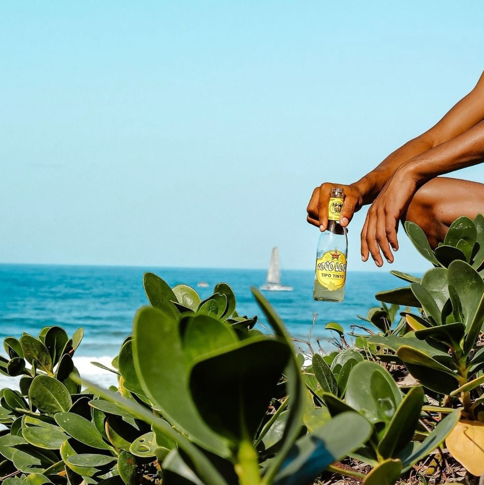
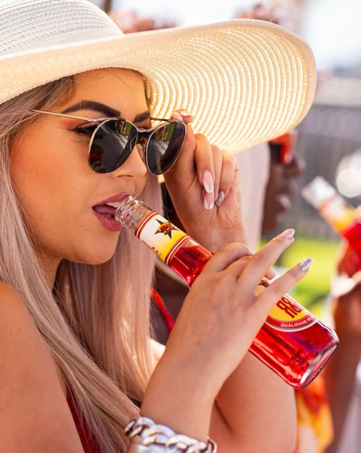
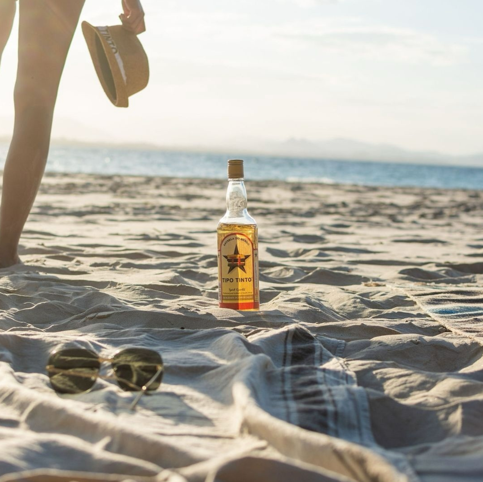
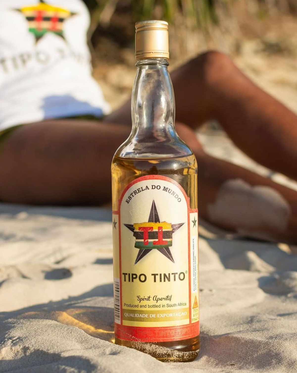
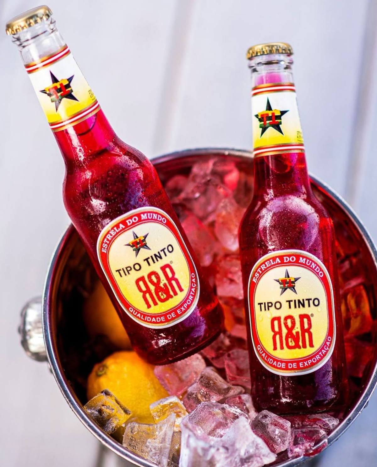
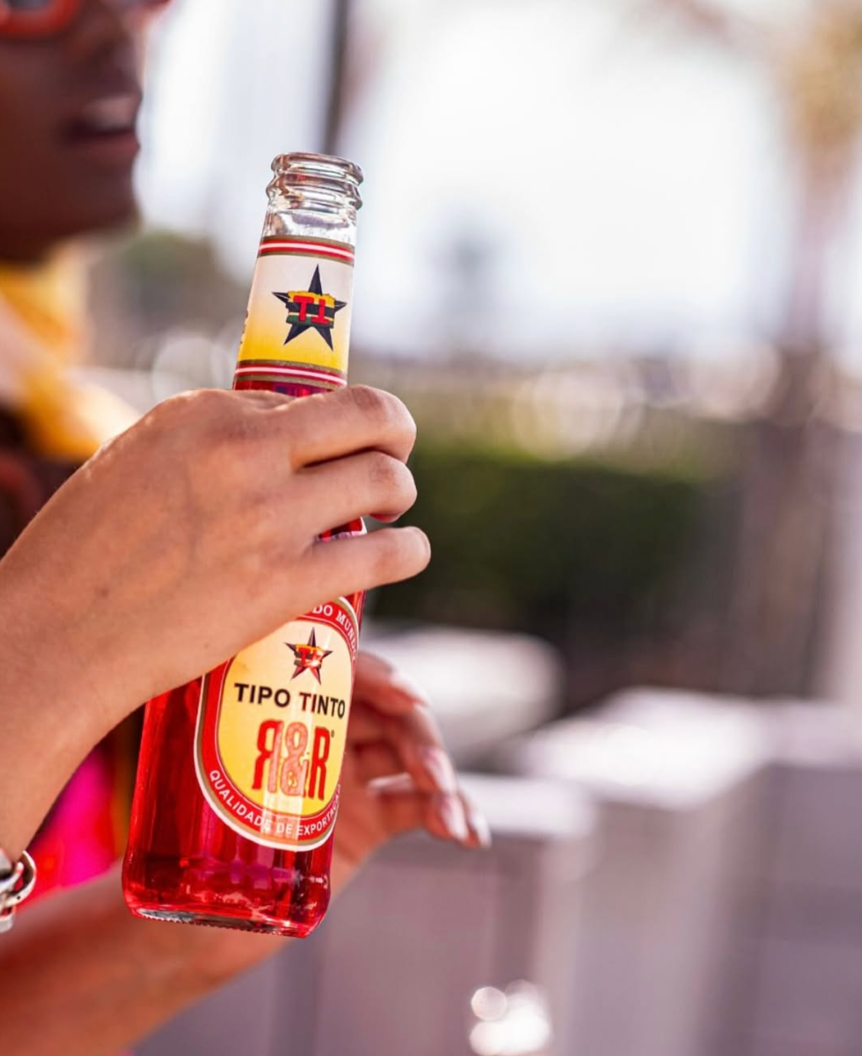
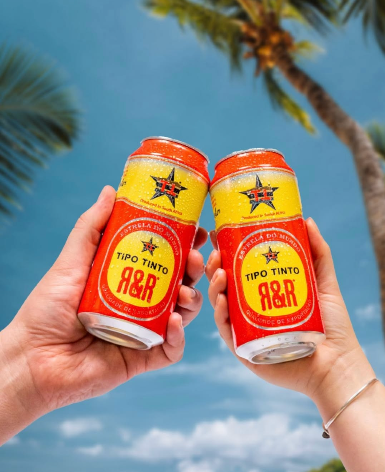
Tipo Tinto's Rum & Raspberry offering — aka R&R — was more than a flavour drop; it was a full-blown mood. Our goal? Build a brand experience that felt just as refreshing and rebellious as the product itself. From the jump, this project called for a design system that could own summer, feel culturally in tune, and be instantly iconic on-shelf and on-scroll. Every touchpoint — from the bottle silhouette and label system to lifestyle photography and POS — was crafted to turn curiosity into loyalty.
Tipo Tinto's Rum & Raspberry offering — aka R&R — was more than a flavour drop; it was a full-blown mood. Our goal? Build a brand experience that felt just as refreshing and rebellious as the product itself. From the jump, this project called for a design system that could own summer, feel culturally in tune, and be instantly iconic on-shelf and on-scroll. Every touchpoint — from the bottle silhouette and label system to lifestyle photography and POS — was crafted to turn curiosity into loyalty.
Design Approach
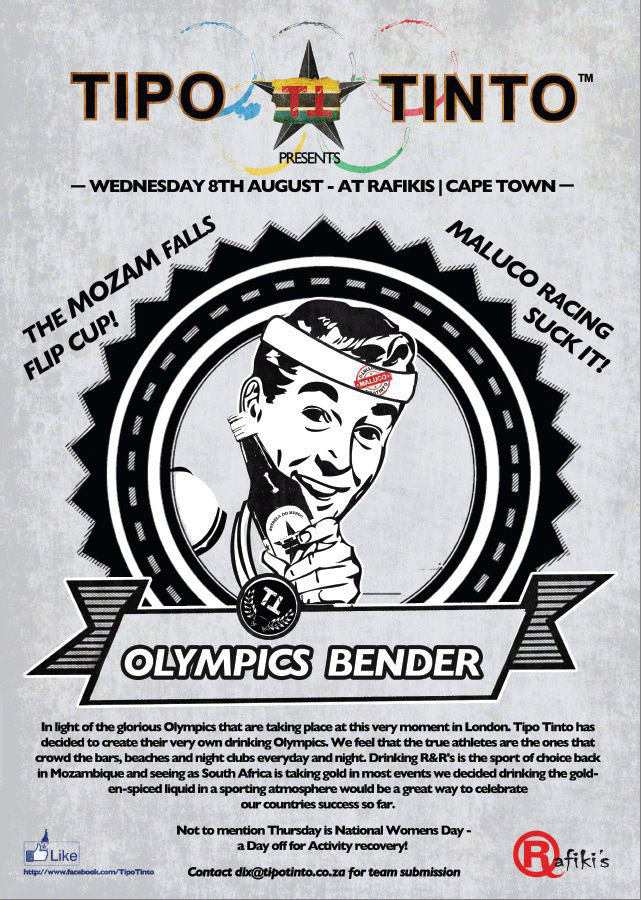
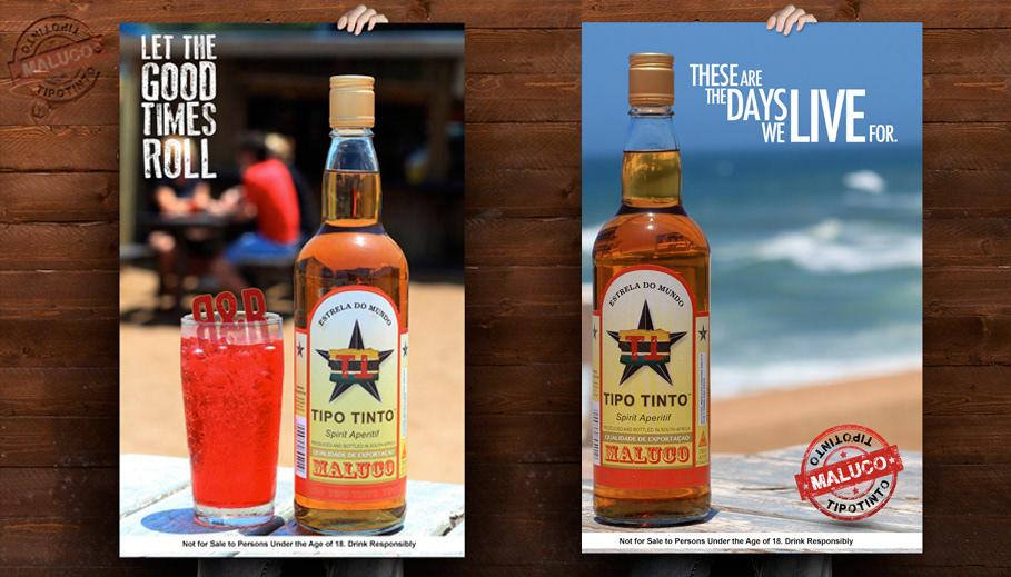
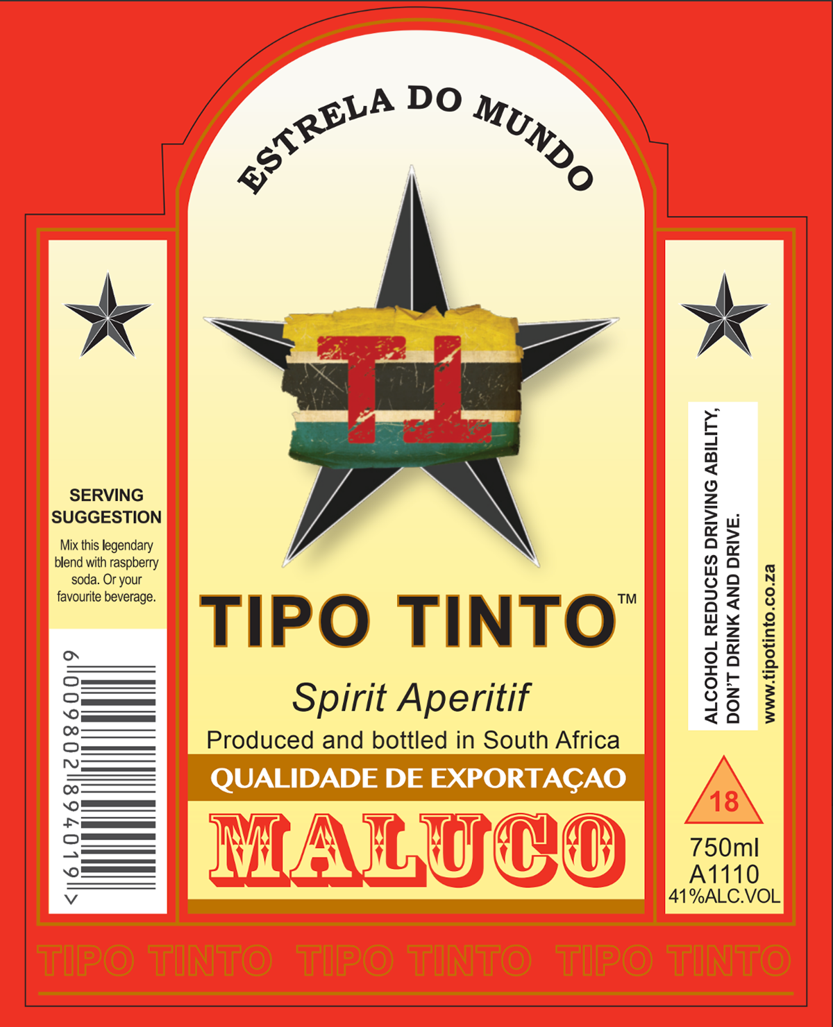
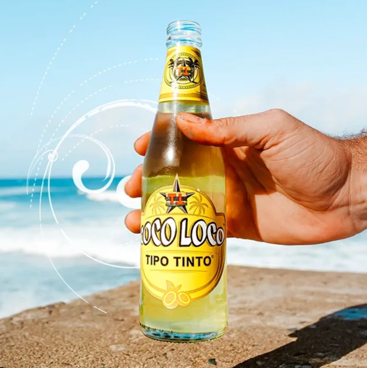
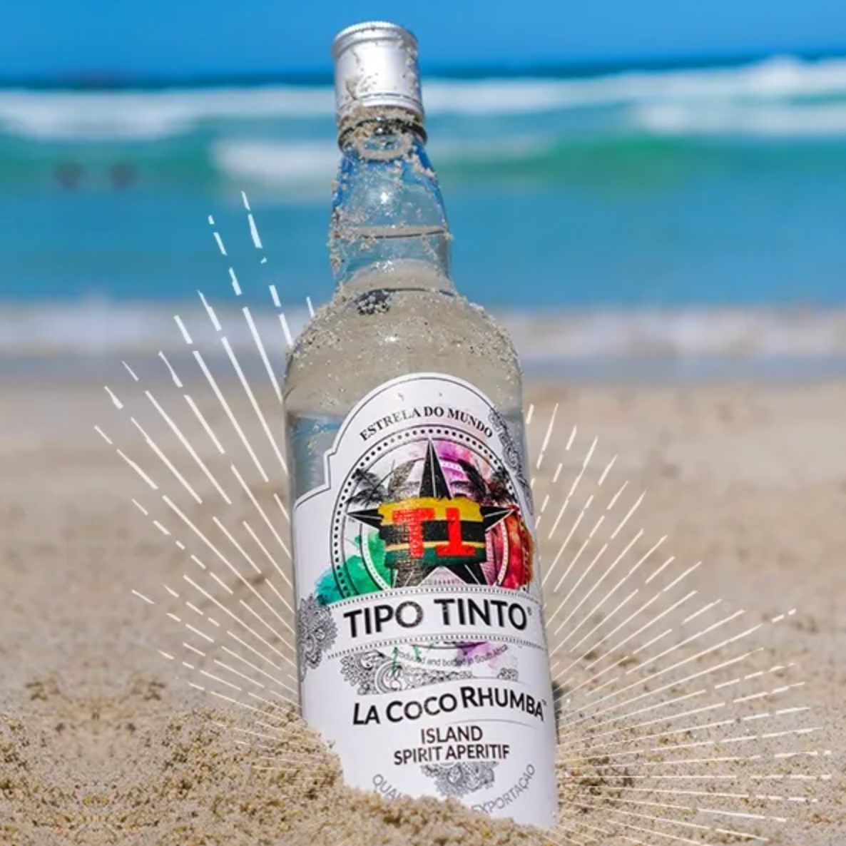
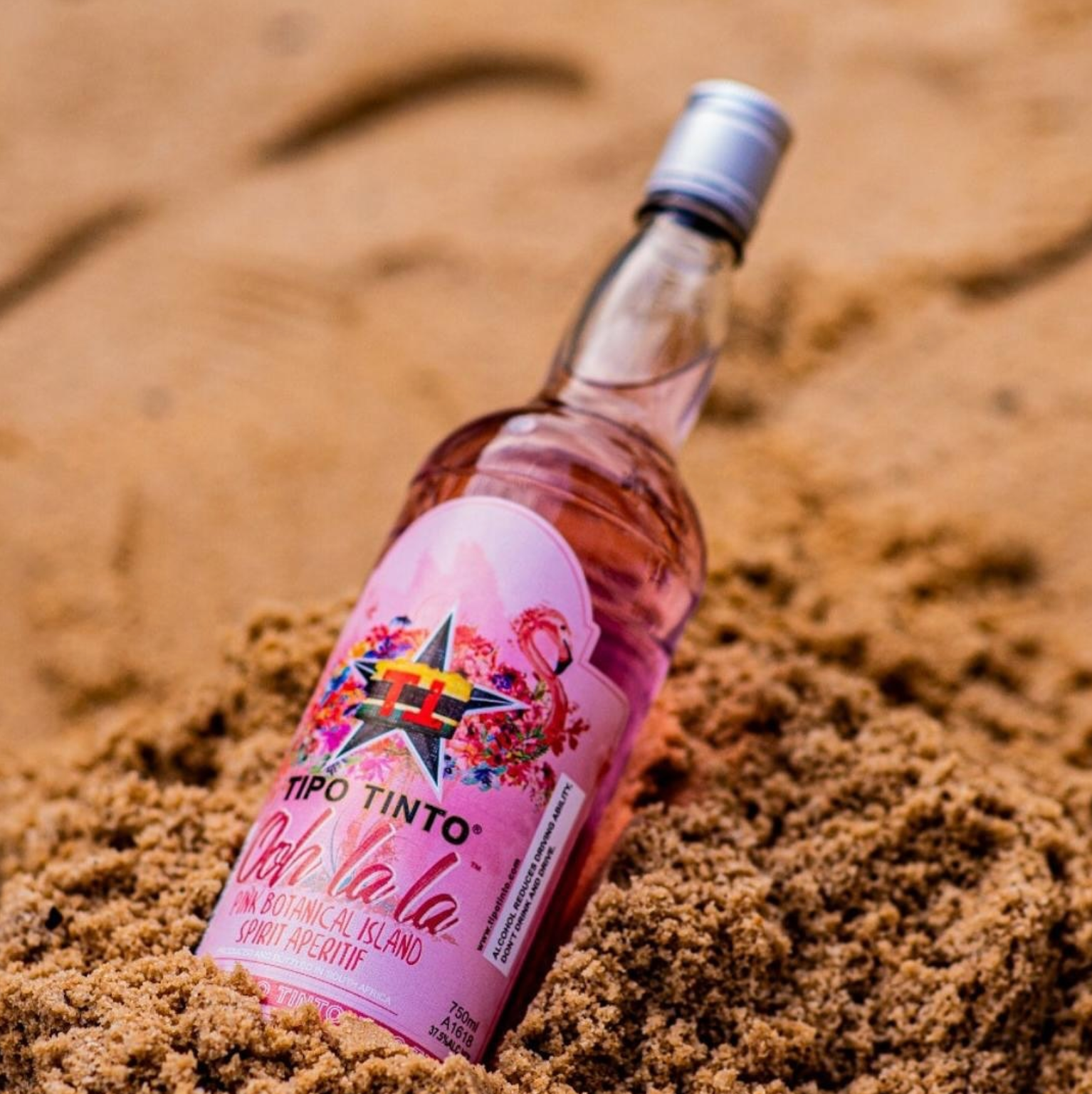
Packaging: Bold, nostalgic, and unmistakably tropical. We designed across bottle, can, and multi-pack formats to ensure standout across every buying moment — fridge, shelf, or sand.
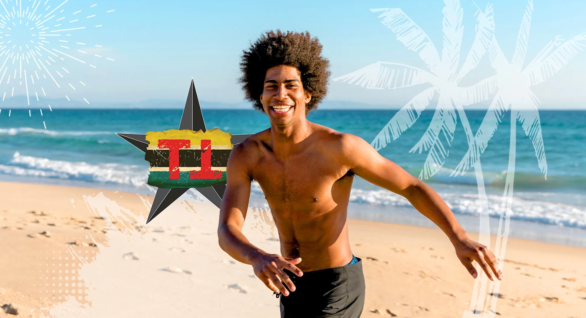
Visual Language: A playful fusion of heritage and beach culture, balancing modern linework with warm, sun-faded hues. Inspired by Mozambique, made for anywhere fun is being had.
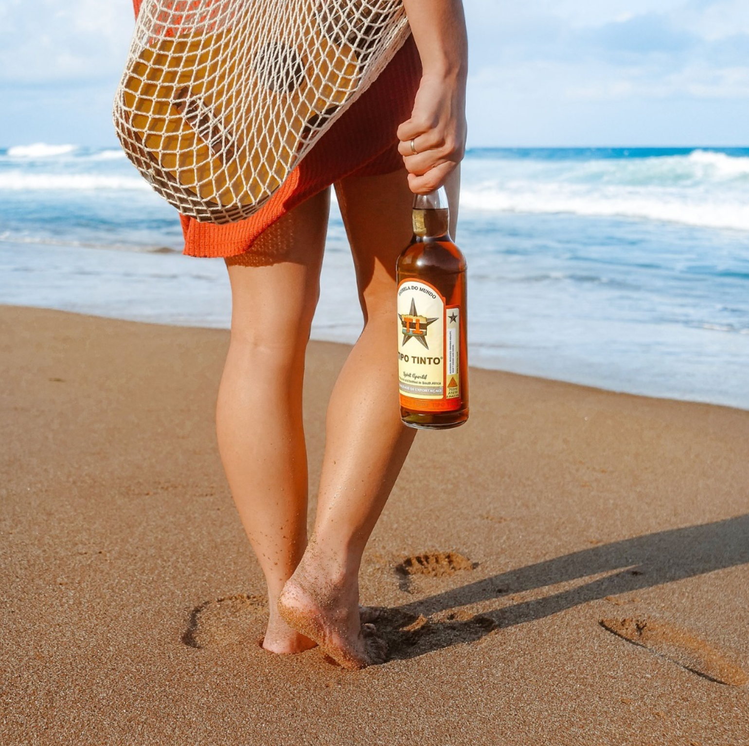
Photography: We directed and captured a campaign full of motion, sunlight, and social ease. From real environments to lifestyle detail shots, the visuals sell a vibe: chilled, connected, carefree.
Brand System: Modular and flexible — the identity lives across digital, print, packaging and outdoor with confidence and clarity.